One of the reasons you are hosting or taking part in a link party is to get more clicks on your images (aka your posts) and increase readers' engagement on your blog.
A good way to manage this is either advising your readers to submit good photography links, if you are the host of the blog party or submitting good photography links to the link party you are invited if you are the guest.
Reading the following post will shed more light on the above statement and help you raise your blog's prestige!
Let's see what a good image link can do!
Support your point
A nice, beautiful and interesting image can attract your readers' attention and urge them to share it in social networks. It can also add real value and insight into your blog-link. Getting your readers to stop and think is something every blogger hopes to do.
Let's see an example:
Suppose that your link party theme is "October colors".
From the two following images, which one would you choose?
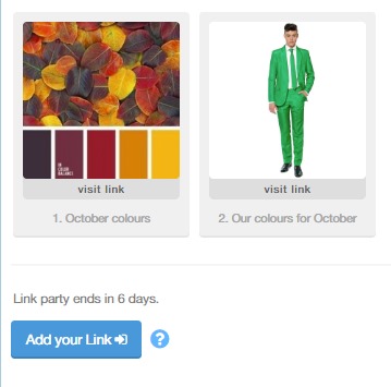
Well, I bet you know the answer...that's exactly my point!
Present your message
Another perspective of images is that they can make an introduction to your topic. Readers usually notice images first and as this photo is going to be used as a thumbnail on your blog and social media may have a huge impact on your traffic. Is it compelling enough to motivate the readers to find out more? Does it tell them what your blog is about?
Let's say that your blog is about "Recipes". And the theme of the link party is "Recipes" also. Which of the following images do you believe would give the reader a clear view of what your blog is about?

"The first one." You will point out correctly.
Make your blog more memorable
If you get a fantastic picture, an image that's both cool and interesting your readers and followers will love it and want to share it with their friends. Thus you will gain more traffic to your blog.
Notice the two following images. They have the same theme. "Desert". However, the camel figures in the second one, make it stand out.
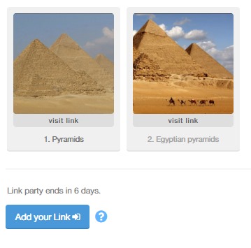
Achieve an emotional connection
As it is said, an image is worth 1000 words. A single image can bring on deep emotions and meanings to another person. If the theme of the link party allows it, you should pick an image that will touch your readers on an emotional level. The readers may have different emotional reactions. They could be happy, excited, etc. Since the photo can cause various reactions, the audience will react positively to it.
Now your link party theme is "Summer". How can you support it better?
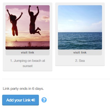
You will point out, that both of these photos are beautiful. True. But only the first one brings joyful and carefree emotions to the readers.
Show professionalism
This way, you infuse trust with your readers.
Our theme is "Fashion" and we have the two following images:
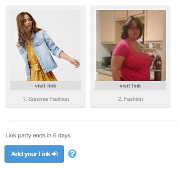
Which one do you believe seems more professional? That's right, the first one!
Hold the attention longer
Since your image is beautiful, your audience will enjoy looking at it. Because of that, they will click on it and visit your blog. It can even increase the chances that your reader will check on other contents of your blog especially if it is full of beautiful and interesting images.
Another link party theme is "Garden".
Look at the two following images:
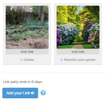
Which one is more beautiful and holds the attention longer? Yes... the second one!
Your blog link looks outstanding
The right image will individualize your blog and help you convert a lot of readers. This way it will stand out from millions of others.
Let's say that our theme is "Nail polishing". Which of the following two do you believe stands out from the other?
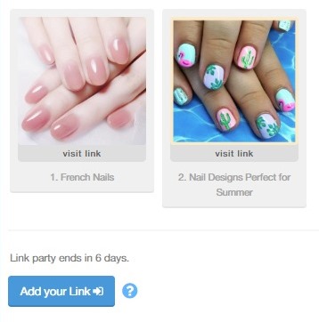
Apparently the second one again.
It gives a personal touch, YOUR personal touch.
A valuable photograph portrays the true nature of you and your blog. Customize the design, size, and quality of your photos and promote the personality of your blog. When people visit your blog, they want to know the people they will be interacting with.
As we mentioned in size, it is a good opportunity to give you a small tip about that. According to some interesting information I found from Dr Lars Muckli, from the University's Institute of Neuroscience and Psychology, "When direct input from the eye is obstructed, the brain still predicts what is likely to be present behind the object by using some of the other inputs to come up with best guesses." This why you should be very careful when you select the part of your image that will be used as a thumbnail. Our brain plays games and trying to guess what is the part of the picture that's missing might lead to misunderstandings and "click loss".
Take a look at the following example to see what I mean:
Look at the following thumbnail. What would you think?
"Ok, just some pyramids. And the rest is sand....sand...and sand again. And maybe some more pyramids."
However, if you take a look at the whole picture, you will see that there is more than pyramids.
There is also a couple on a camel. Now if you have chosen "Figure 10" as a thumbnail:
You could imagine that on the left side of the photograph there is also one, or more pyramids. The photograph becomes a lot more interesting than if it included only pyramids.
So be careful which part of the image you will choose as a thumbnail!
References:
- http://www.thesocialmediahat.com/article/10-benefits-using-images-blogs
- http://browngirlbloggers.com/2015/01/taking-blog-photos.html/
- http://naldzgraphics.net/design-2/advantages-high-quality-photos-website/
- http://www.edirectlink.net/6-benefits-of-photography-for-your-business/
- http://phys.org/news/2011-04-eyes-brain.html


